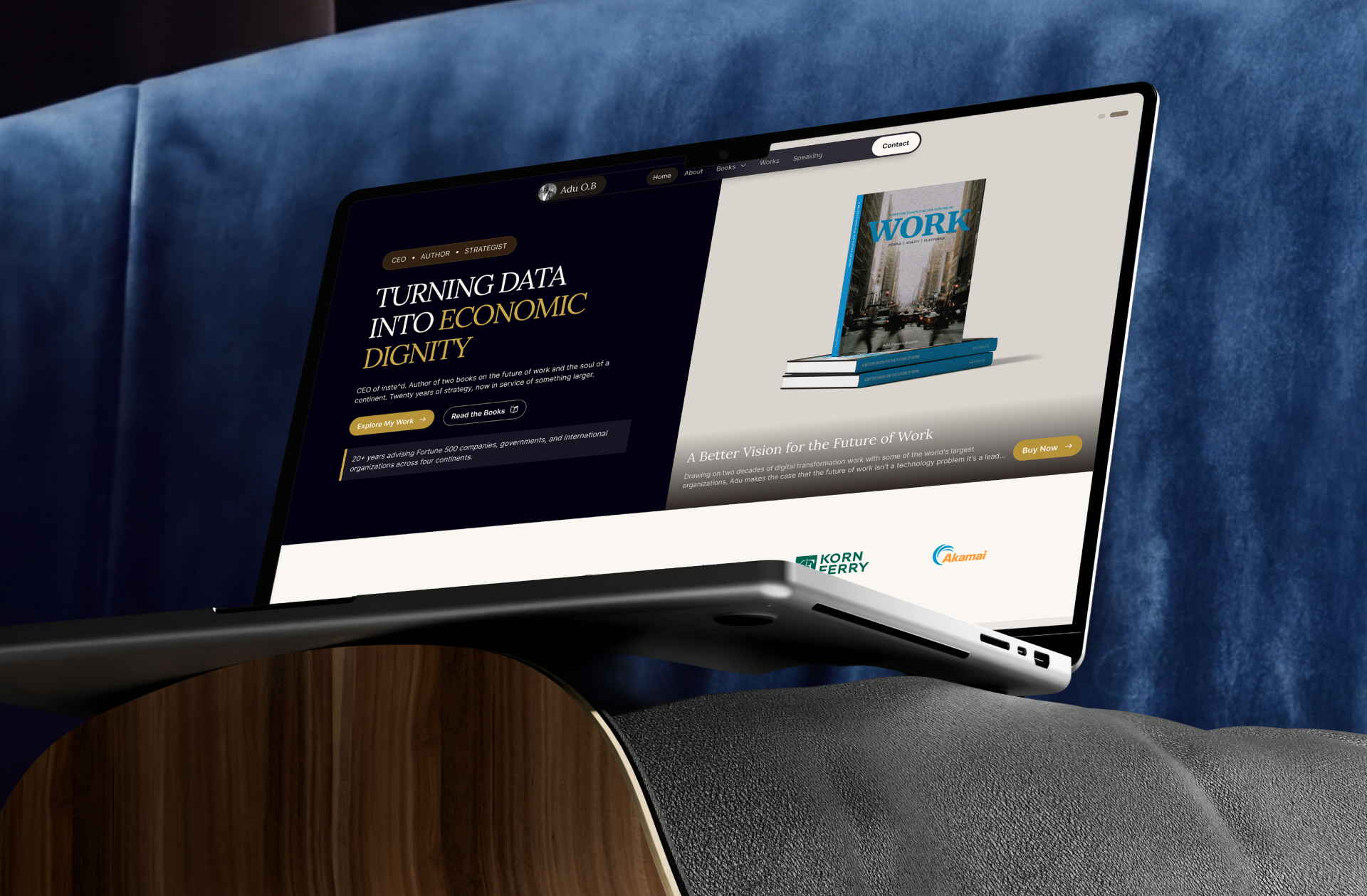


Adu O.B. — Author, Strategist & Founder Website Design And Development
Personal brand site for an author-founder, uniting his books, company, and 20 years of advisory.
Expertise
Personal Branding
Next.js Development
Editorial Design
Design System
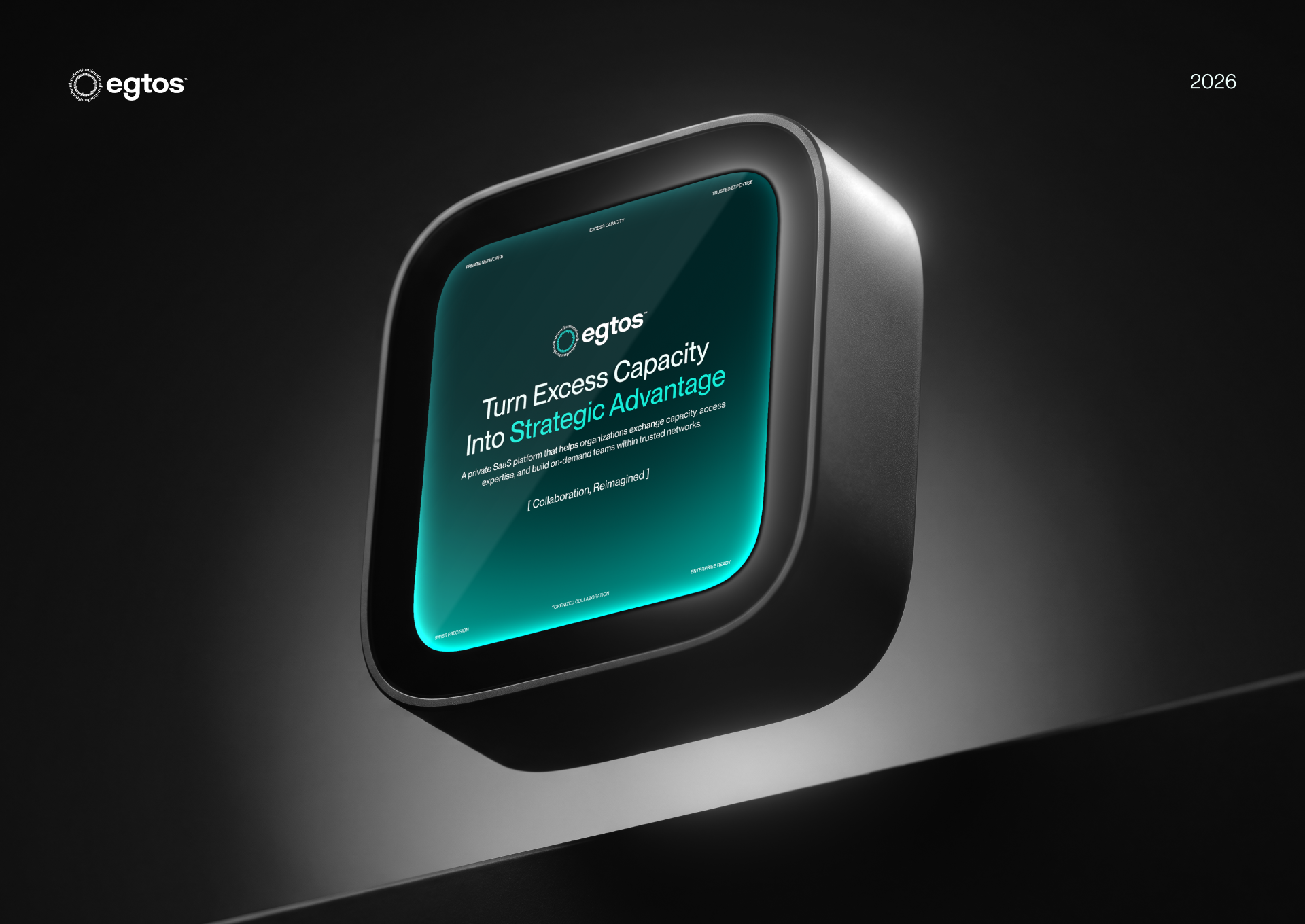
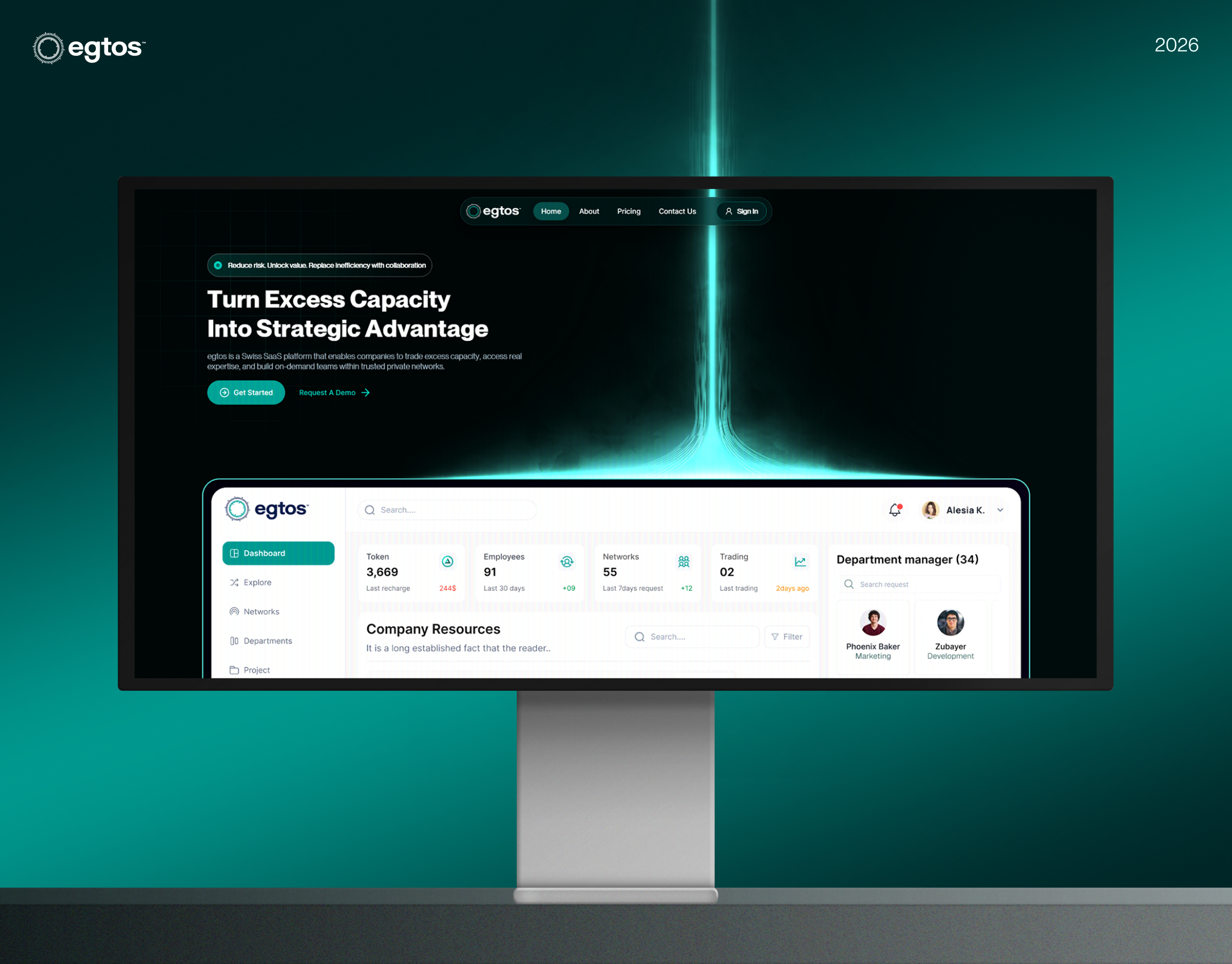
Enterprise buyers rarely commit on a first visit. Before requesting a demo of a B2B platform, someone on the buying team is reading the site to decide if it's credible, who else is already using it, and whether it's worth their team's time. For egtos — a Swiss platform where companies trade excess capacity, access outside expertise, and build teams through private networks — that first impression carries more weight than usual, because the pitch is genuinely three-sided: enterprise, consulting firm, and independent specialist, all in one product.





Most enterprise SaaS sites try to do too much in one scroll — explain the whole model, speak to every buyer type, and ask for a demo, all before a visitor has decided the company is worth trusting. When the product itself is three-sided, that crowding gets worse, and the actual value proposition gets buried under it.
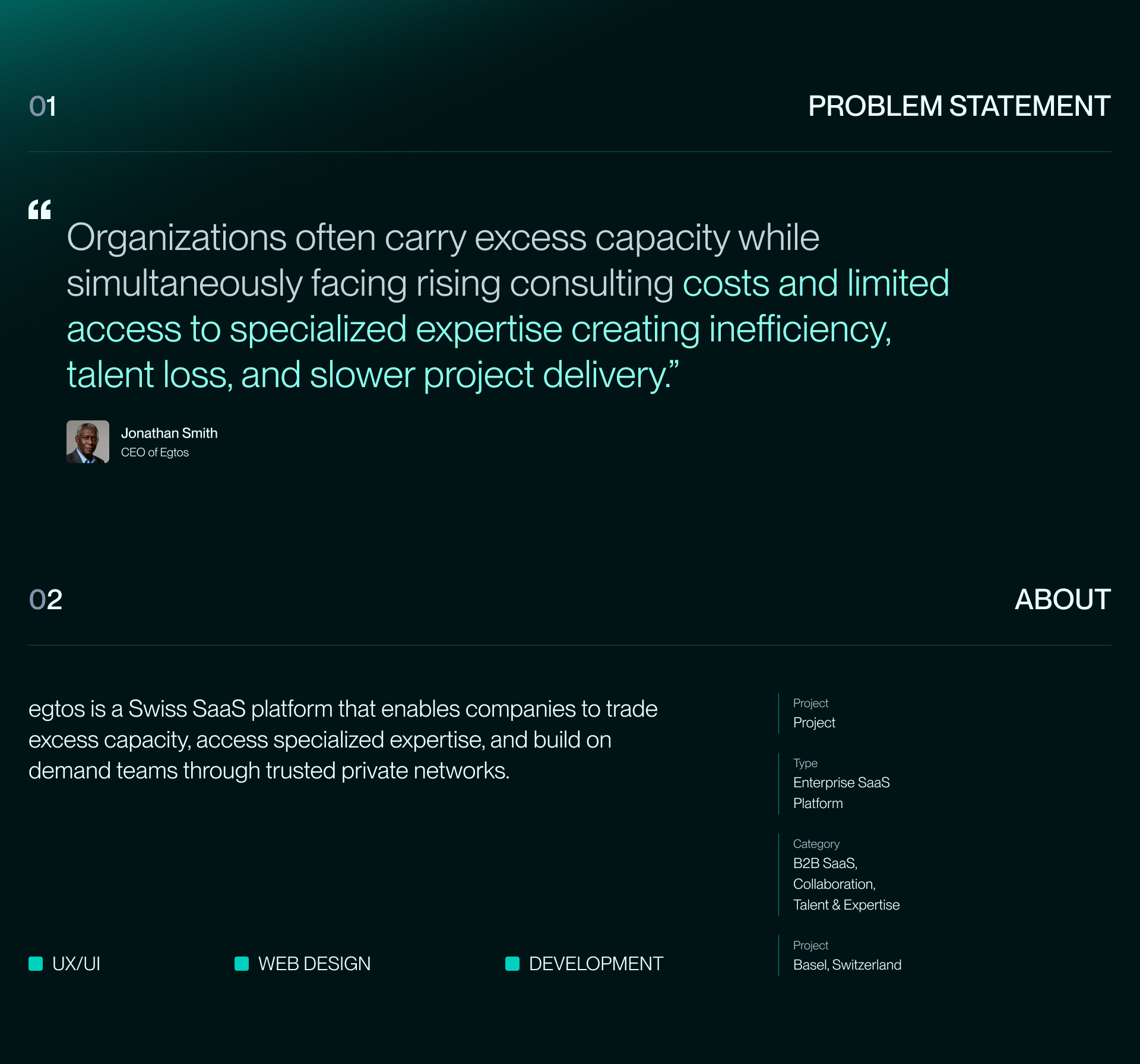
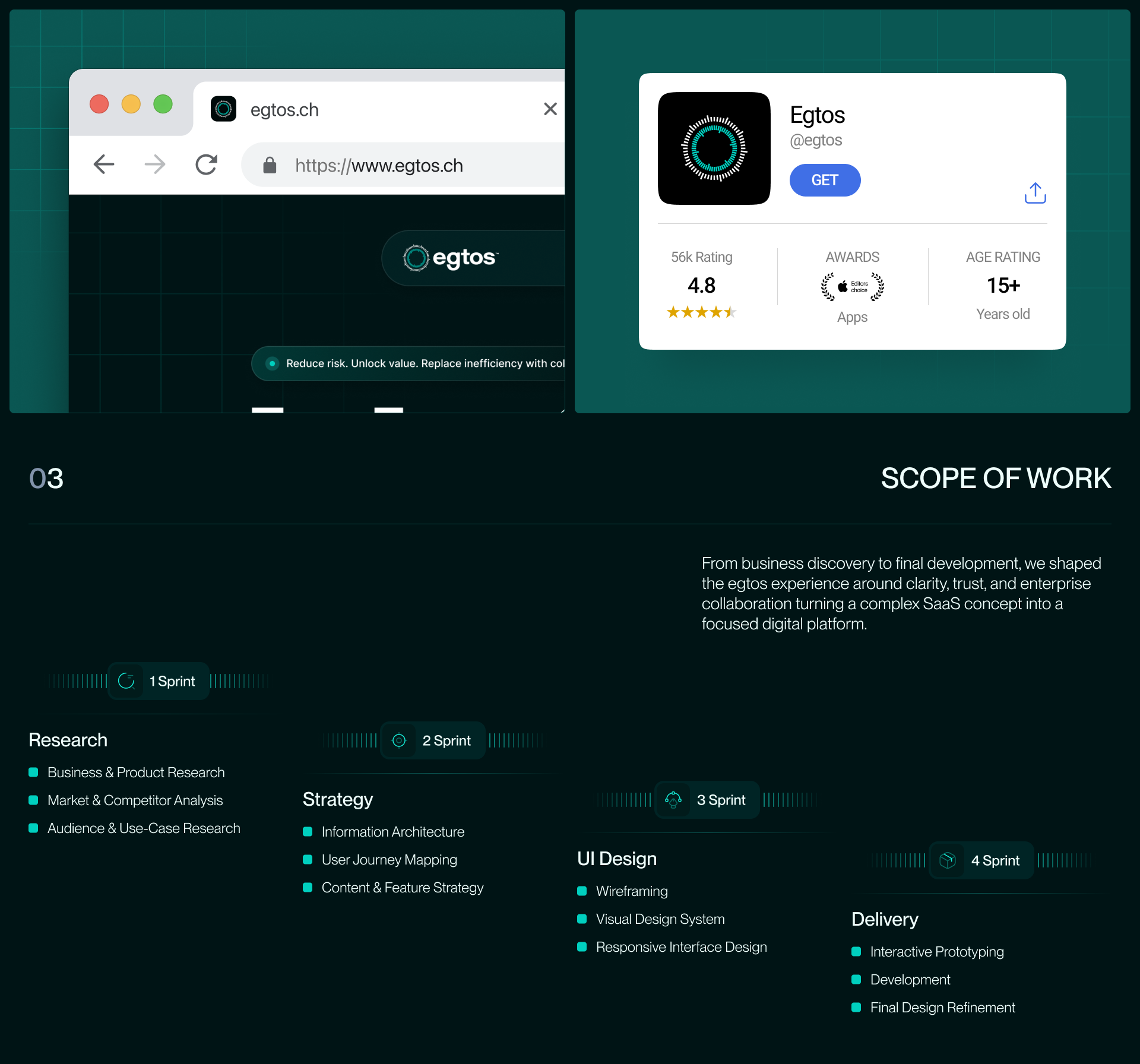
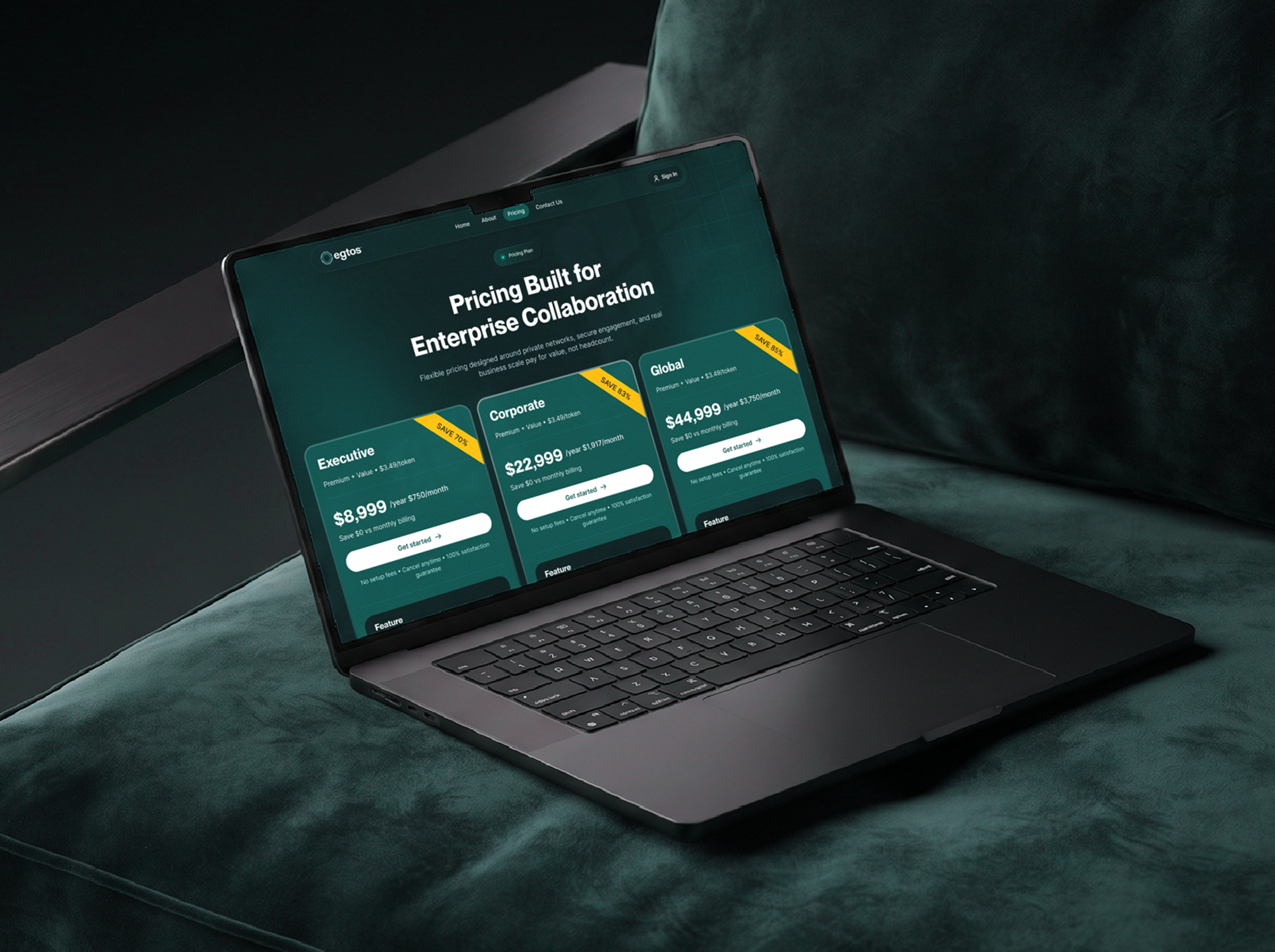
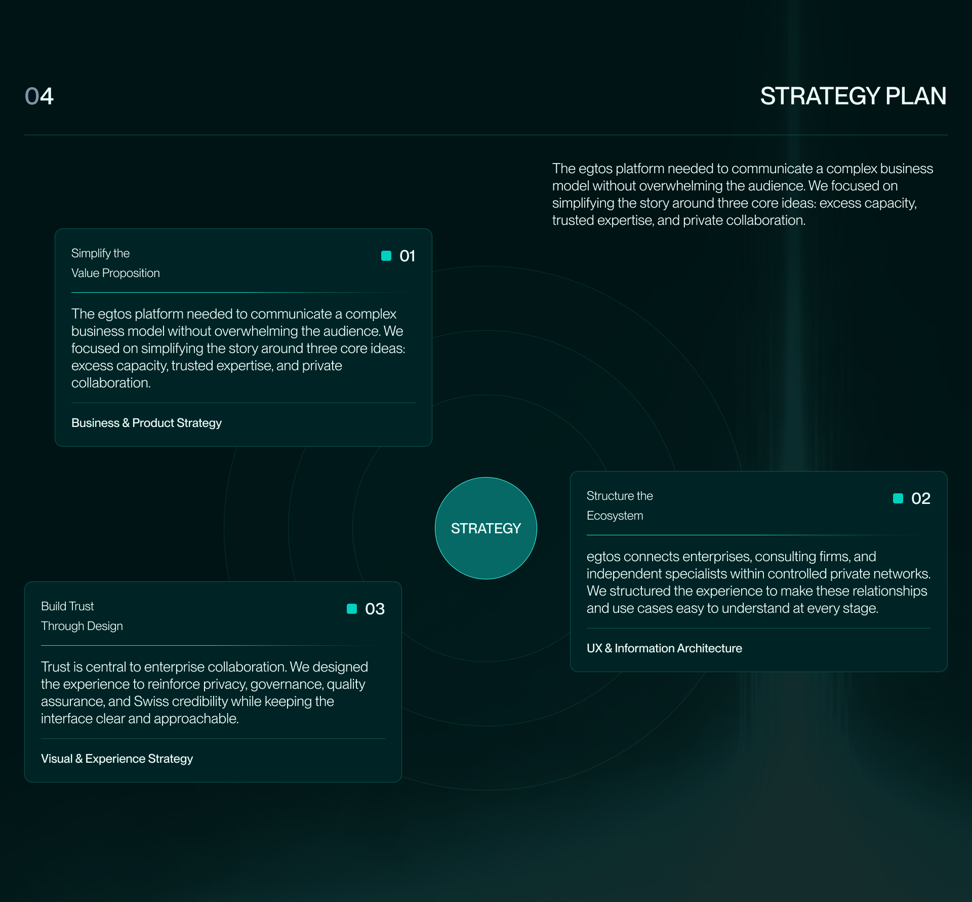
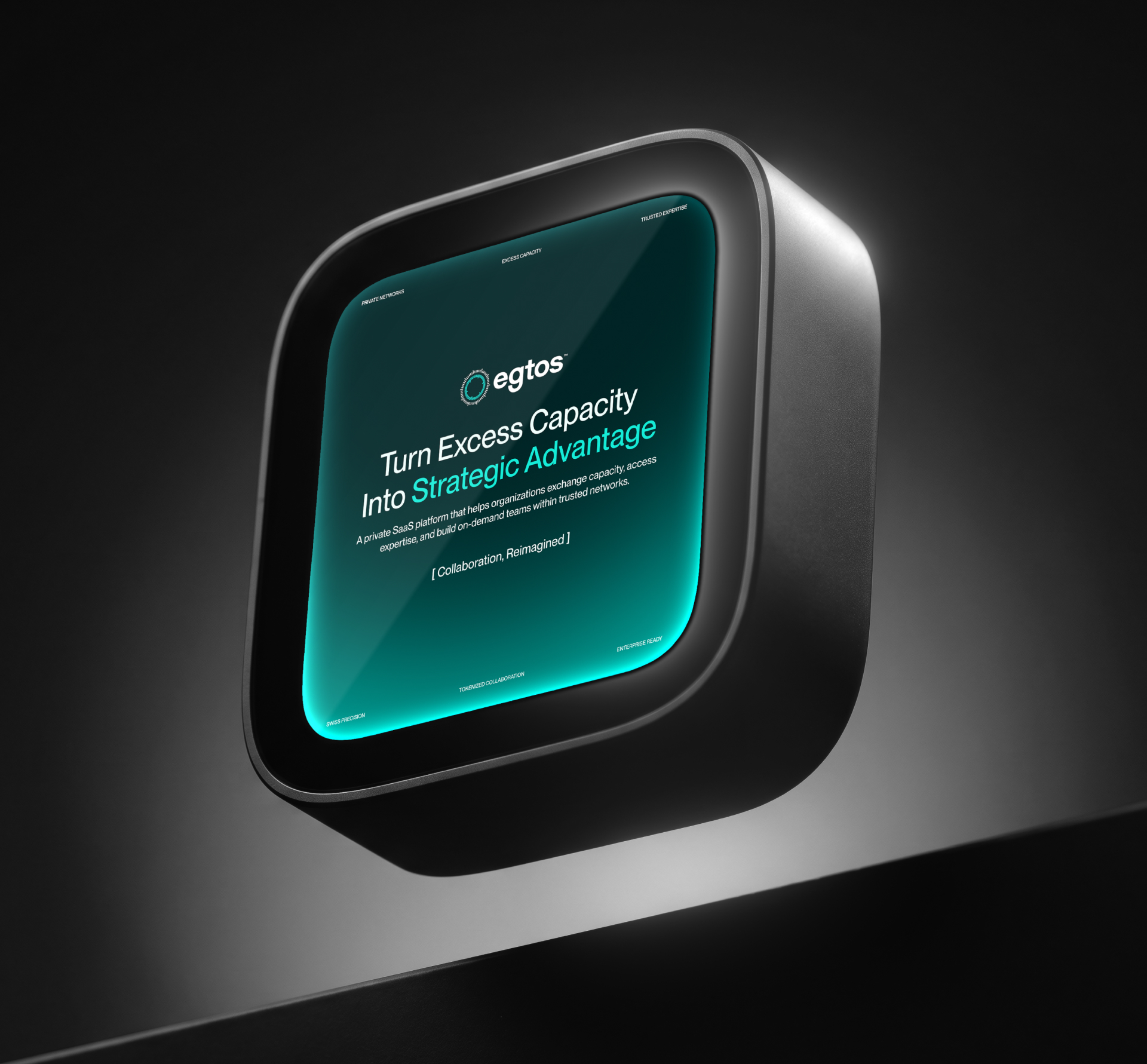
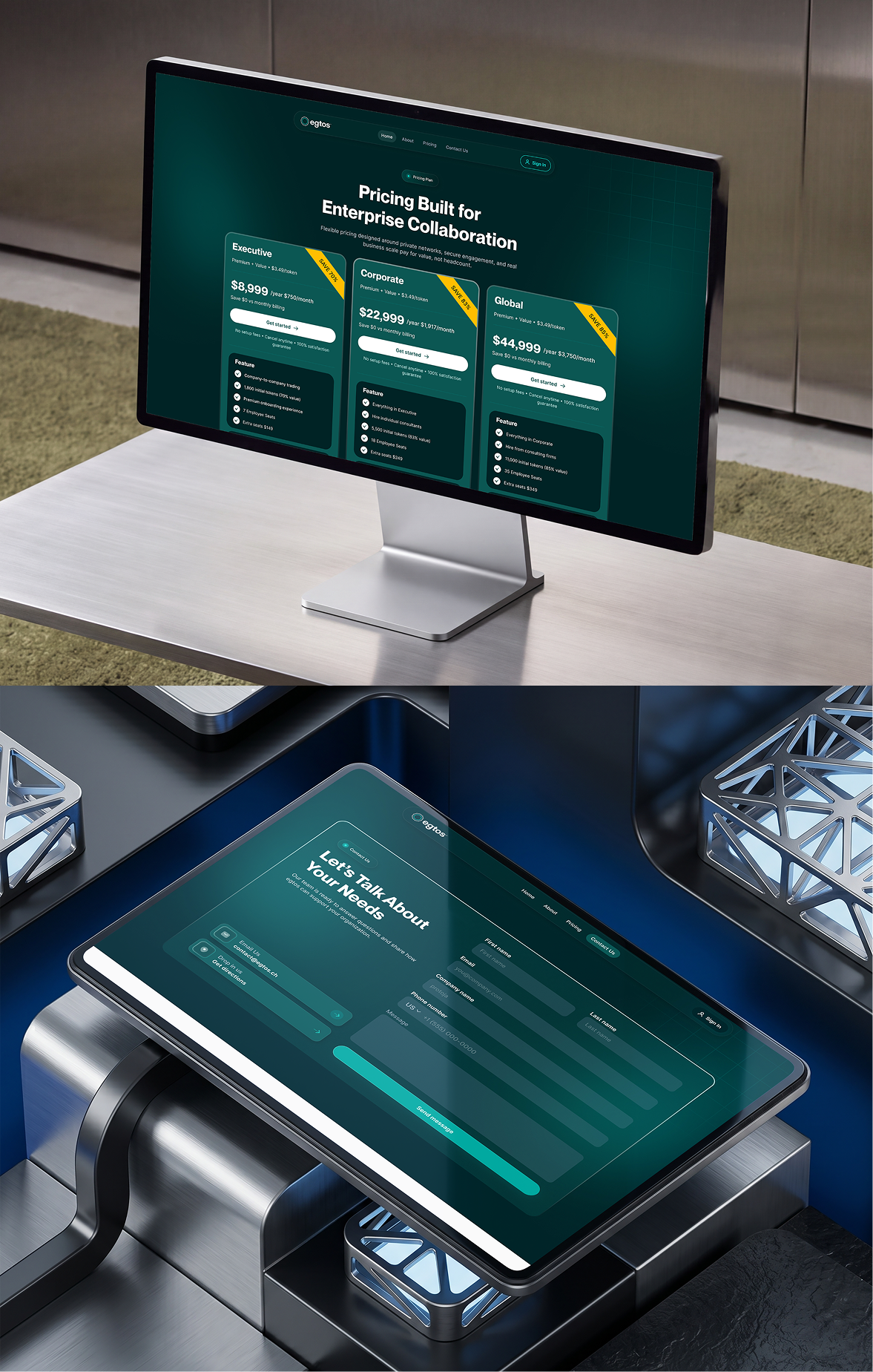
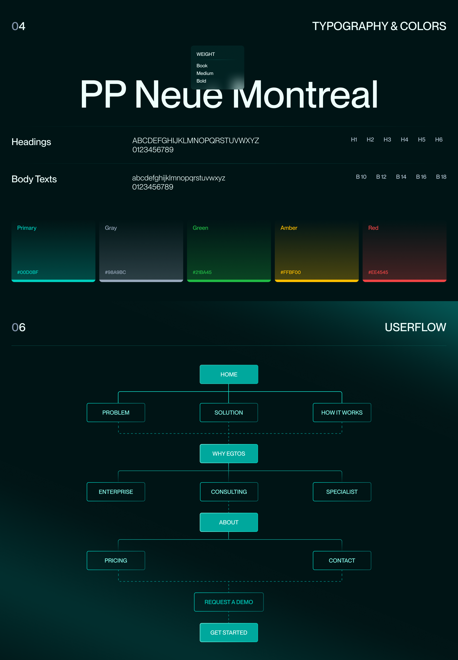
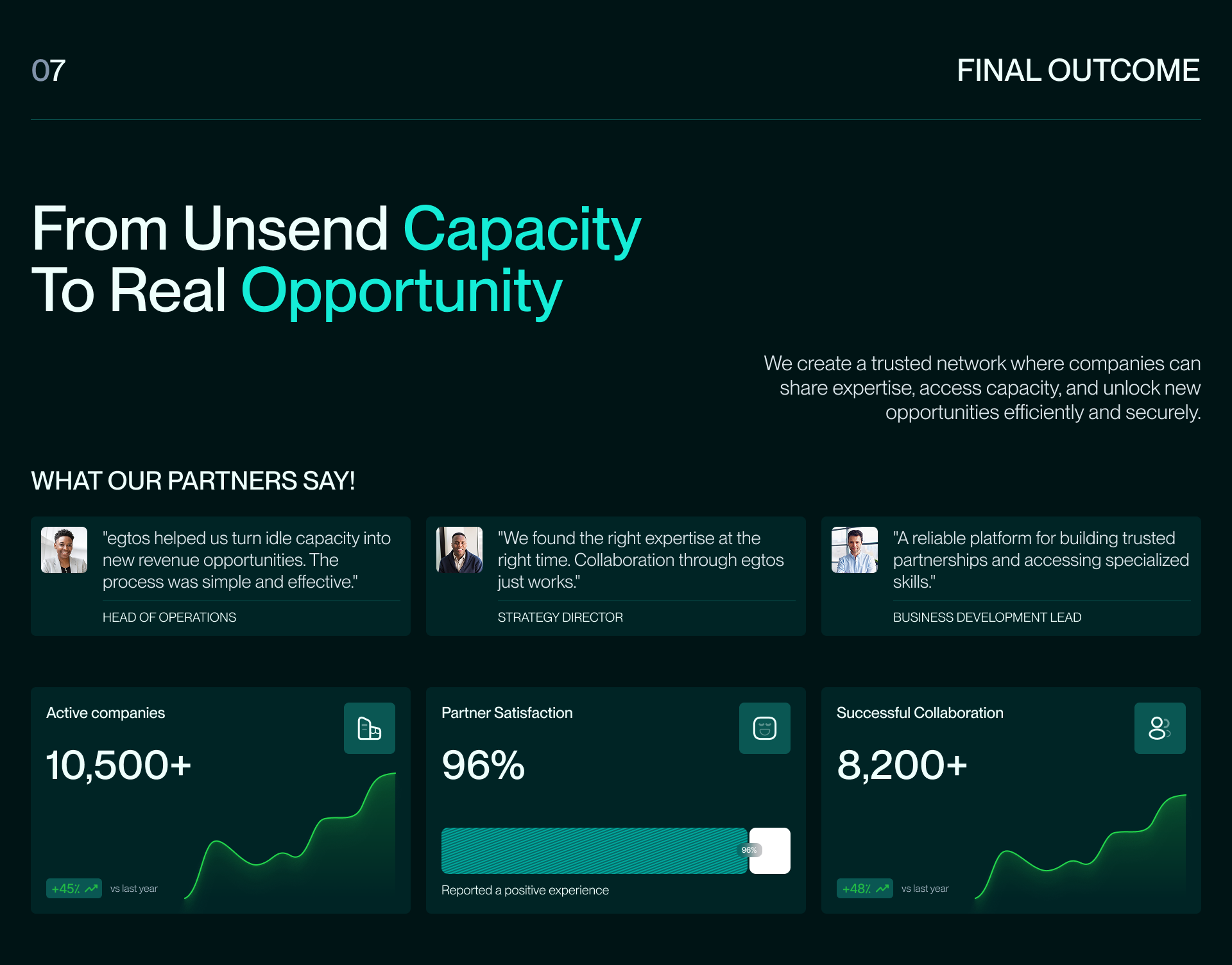
We designed egtos's marketing site around three ideas instead of ten: excess capacity, trusted expertise, private collaboration. The homepage opens on the platform's own problem statement, in the CEO's words, before a single feature gets mentioned. Buyer paths split by audience — Enterprise, Consulting, Specialist — so each visitor reads only what applies to them. Trust markers (Basel, Switzerland as the base; a 4.8 rating across 56K reviews; an Editor's Choice award) sit near the top of the page instead of the footer, and pricing breaks down by scale — Executive, Corporate, Global — so a buyer can self-qualify before booking a call.
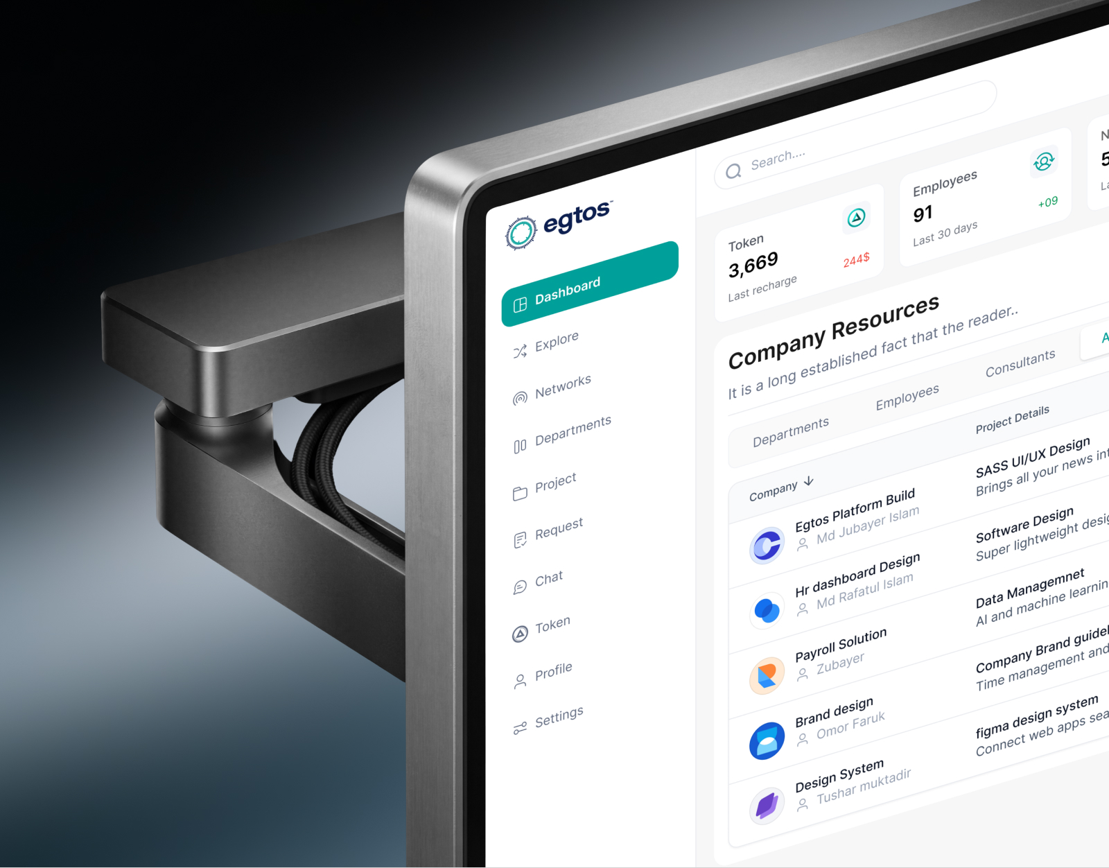
A three-sided pitch simplified into three ideas — excess capacity, trusted expertise, private collaboration — with trust markers moved above the fold and buyer paths split by audience. A Figma concept for the egtos.ch marketing site, designed by mound Studio's team.