







Branding
What Is Included in a Brand Identity Package? A Clear Breakdown for 2026

Most founders start a brand identity with a logo. That makes sense, since the logo is the visible part. But a logo alone does not make a business recognisable. A brand feels consistent when several pieces work together: what you stand for, what you are called, how you look, and how you sound.
The question we hear most is simple: which elements do we really need, and in what order? This guide answers it. You will get the eight elements of a brand identity, what each one contains, the order to build them in, and what to do first if you are on a tight budget or just launching.
If you are still comparing what a designer should deliver, our post on what is included in a brand identity package is a good companion to this one.
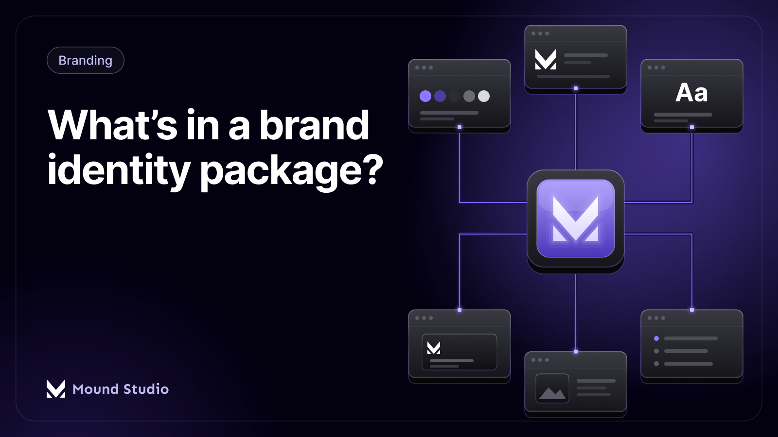
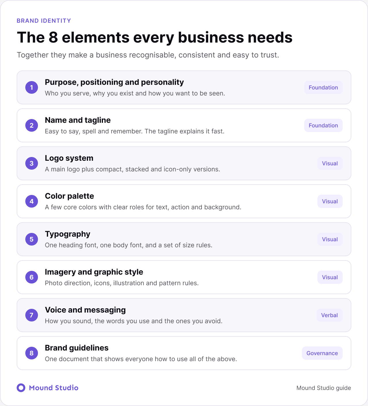
Every business needs eight brand identity elements: purpose, positioning and personality, a name and tagline, a logo system, a color palette, typography, imagery and graphic style, voice and messaging, and brand guidelines. The first two decide who you are, the next four decide how you look, the seventh decides how you sound, and the last one keeps everything consistent as the business grows.
The three terms get mixed up constantly. Brand strategy is the thinking: who you serve, why you exist, and how you want to be seen. Brand identity is the set of assets and rules that express that thinking, such as the logo, colors, type, imagery, and voice. Branding is the wider, ongoing practice of shaping how people perceive your business, including customer service, pricing, and reputation. This guide focuses on identity, but the first two elements below are really strategy, and that is on purpose. Identity without strategy is decoration.
This is the foundation. Purpose is why the business exists beyond making money. Positioning is who you serve and how you are different from the alternatives. Personality is how you want to be seen: calm or bold, formal or friendly, premium or approachable.
Every later choice, from the color of a button to the tone of an email, should trace back to this element. When teams skip it, they end up debating logos by taste instead of by fit.
A name should be easy to say, easy to spell, and free of confusion with competitors. A tagline is optional but useful when your name does not explain what you do. It should be short and clear, and it should describe a benefit or a category, not a slogan for its own sake.
Before you commit to a name, say it out loud on a call, type it into a search box, and check whether the domain and social handles are available. Legal checks matter too, and they depend on where you operate.
A logo is not one file. It is a small system. A main logo carries most of the work, but you also need a compact or stacked version for tight spaces, and an icon-only mark for profile pictures, app icons, and favicons.
Test the logo small. If it falls apart at the size of a browser tab, simplify it.
A useful palette is small and has clear roles. One or two primary colors carry the identity. A few neutrals handle text and backgrounds. An accent color is reserved for actions and highlights. The goal is not variety, it is consistency.
Give each color a job and write it down: which one is for headlines, which for buttons, which for backgrounds. Also check contrast between text and background early, so the palette stays readable for everyone.
Typography sets the voice of your visuals. Most brands do well with one heading font and one body font, plus rules for size, weight, and spacing. Choose fonts that read well on screen, that have the weights you need, and that you are licensed to use on the web and in print.
Typography rules should cover the basics: heading sizes, body size, line spacing, and when to use bold. A short set of rules is easier to follow than a long one.
This element covers everything visual that is not the logo, color, or type: photography direction, illustration style, icons, patterns, and how graphics are cropped or framed. It is what makes two brands with similar colors look completely different.
Decide what your images should feel like, and what they should never look like. A clear direction stops the slow drift toward random stock photos that make a brand feel generic.
Voice is how you sound in writing and speech. Messaging is what you say: your core message, the few points you repeat, and how you describe your products. Together they make a business sound like one person, not a dozen.
Guidelines pull everything into one document. They show anyone, inside or outside the company, how to use the logo, colors, type, imagery, and voice correctly. A good guide has examples of right and wrong use, so nobody has to guess.
They can be short at first. A few pages that cover the essentials are more useful than a long document nobody opens.
Perfection is not the goal. Each element only needs to be clear enough that someone else can use it without asking you. A few quick tests help:
If an element fails its test, fix that one before adding more.
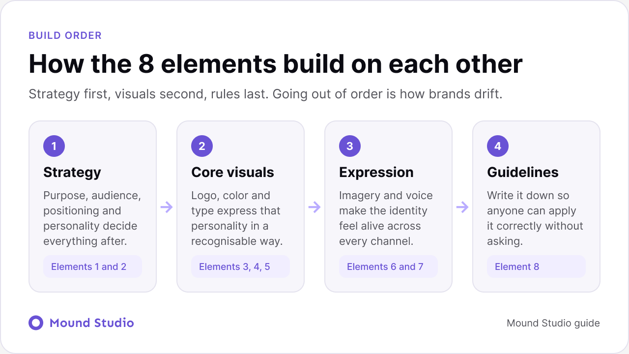
The order matters. Strategy comes first, visuals second, and rules last. When teams design a logo before deciding who the brand is for, they often redo it later.
| Stage | Elements | Question it answers | What you end up with |
|---|---|---|---|
| Strategy | 1 and 2 | Who are we, and who is this for? | Positioning, personality traits, name, tagline |
| Core visuals | 3, 4, and 5 | What do we look like? | Logo system, palette, and type rules |
| Expression | 6 and 7 | How do we come alive across channels? | Imagery direction, voice, and key messages |
| Guidelines | 8 | How does everyone apply it correctly? | A brand guide with examples |
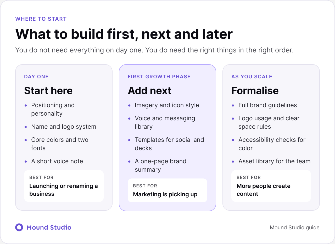
You do not need everything on day one. You do need the right things in the right order. The right scope depends on the stage your business is at.
| Business stage | Build these | Can wait |
|---|---|---|
| Just launching | Positioning, name, simple logo, two colors, two fonts, a short voice note | Detailed imagery rules, full guidelines |
| Marketing is picking up | Imagery style, a messaging library, templates for social and decks, a one-page brand summary | A full brand book |
| Team is growing | Full guidelines, logo usage rules, accessibility checks, a shared asset library | Nothing, this is where consistency pays off |
Picture a new bookkeeping service for freelancers. The positioning is simple: calm, clear help for people who dislike finance. That leads to personality traits like friendly, precise, and unhurried. The name is short and easy to spell, with a tagline that names the benefit.
The logo is a simple wordmark with a small icon for social profiles. The palette is two calm primary colors with neutral backgrounds and one accent for buttons. One clean sans-serif handles headings and body. Photography shows real workspaces rather than stock handshakes. The voice is plain and reassuring, and avoids finance jargon. A four-page guide captures all of it.
Notice that every choice follows from the first element. That is what makes the result feel like one brand.
Your website is where most people meet your brand for the first time, so it is where gaps show up fast. Colors, type, imagery, and voice all need to be applied consistently across pages. A reusable set of components helps a lot here, which is why we often pair a brand identity with a design system. If your current site no longer matches your brand, our guide on when to redesign your website can help you decide what to do.
A brand identity is a system, not a logo. Build strategy first, visuals second, and rules last, and add the extras as your business grows.
Building or refreshing a brand and not sure where to begin? Talk to us about your brand and we will help you decide what to build first.
The eight elements are purpose, positioning and personality, name and tagline, logo system, color palette, typography, imagery and graphic style, voice and messaging, and brand guidelines.
Start with positioning and personality, a name, a simple logo system, a small color palette, two fonts, and a short voice note. Add imagery rules and a messaging library as marketing picks up.
No. A logo is one element. Without a palette, type rules, imagery direction, and a consistent voice, a business looks different on every channel.
Brand identity is the set of assets and rules that make you recognisable. Branding is the wider, ongoing work of shaping how people perceive the business, and identity is one part of it.
Yes, but keep them short at first. A few pages covering the logo, colors, fonts, and voice are enough, and they can grow as more people create content.