








Product
How Much Does UI/UX Design Cost in 2026? What Actually Drives the Price
These three terms get used interchangeably, and that is where most misunderstandings about branding costs start. A logo is a single mark. A brand identity is the full visual and verbal system: logo, colors, type, imagery, tone, and the rules for using them. Branding is the bigger picture, which is how people perceive you, shaped by identity, product, service, and every interaction.
When a quote for "branding" seems too cheap, it is usually a logo with a color palette attached. This guide shows what a real brand identity package includes, what each piece does for your business, and how to compare quotes without getting confused.
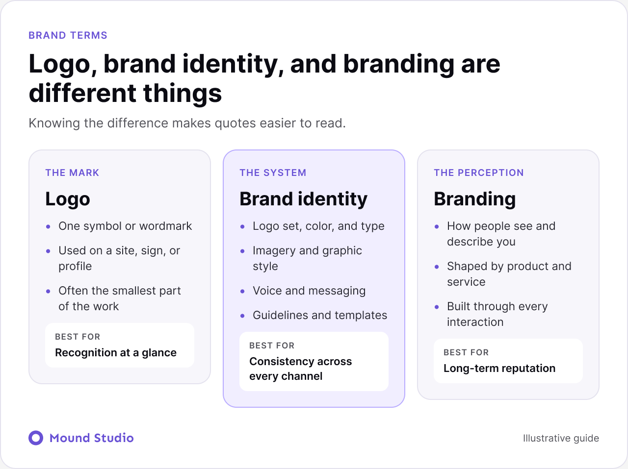
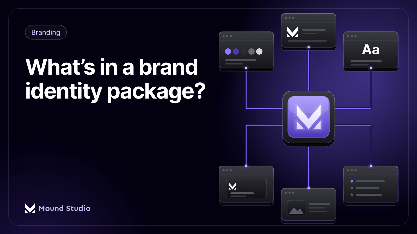
A proper brand identity package includes brand strategy, a logo system, a color palette, typography, imagery and graphic style, voice and messaging, brand guidelines, and templates for real use. The strategy and guidelines are the parts cheap packages leave out, and they are the parts that keep the brand consistent over time.
Every studio works a little differently, but a solid identity project follows the same rough path. Knowing it helps you judge whether a quote covers the whole job.
If a proposal jumps from the first call to logo drafts, the strategy step is probably missing.
The infographic below shows how the pieces fit together, and the sections after it explain each one with what you should receive.

Who you serve, what you stand for, and how you are different. Positioning, audience, and personality. Everything visual later is judged against this. Skipping it is why so many brands look nice and say nothing. You should receive: a short strategy document with positioning, audience, and personality traits.
Not one logo, but a set: primary, secondary, icon, and horizontal and stacked versions. Each one should work in color, in black and white, and at small sizes like a favicon. You should receive: the logo files in the formats you need, with clear space and minimum size rules.
A primary set, supporting colors, and rules for when to use each. A good palette also considers accessibility, so text stays readable on every background. You should receive: color values for screen and print, plus approved combinations.
Fonts for headings and body text, with a clear hierarchy. It should work on your website, in presentations, and in print without extra explanation. You should receive: font choices, licenses or sources, and sizing rules.
The style of photography, illustration, icons, and patterns that feel like you. This is what keeps ten different people from producing ten different looks. You should receive: examples and a short set of do and do not rules.
How you sound. Tagline options, key messages, and short examples of the tone in use. Many packages skip this, and their brand ends up looking consistent but sounding random. You should receive: a tone description and sample copy for a homepage, an email, and a social post.
The document that ties it together. Clear rules and examples for your team, freelancers, and printers, so the brand holds up when you are not in the room. You should receive: a guidelines document or page, plus editable source files.
Business cards, social media templates, pitch deck, email signature, and the like. These turn the identity into something you can use on day one. You should receive: editable templates for the items you use most.
Picture a small professional services business that has grown for a few years on a logo made early on. The logo file exists only as a flat image. Each person on the team uses a slightly different blue. The website, the proposals, and the social posts all feel like they come from different companies.
A full identity project would start by asking what the business wants to be known for and who it wants to reach next. From that comes a positioning statement and a short list of personality traits, such as calm, precise, and direct. The logo system then reflects those traits, the palette gets a clear primary color with supporting shades, and one typeface pair handles both web and print.
The guidelines then answer the questions the team keeps asking. Which logo goes on a dark background? What size is the smallest it can appear? How should a proposal cover look? After that, the templates mean nobody has to start from a blank page.
The result is less about a new look and more about removing guesswork. People stop making style decisions alone because the answers are written down.
Studios bundle these pieces differently. The table below shows how packages typically differ in scope. Names and contents vary between studios, so always read the list of deliverables, not the label.
| Component | Logo only | Starter identity | Full identity |
|---|---|---|---|
| Brand strategy | No | Short summary | Full positioning and audience work |
| Logo system | One logo | Primary and icon versions | Complete set with usage rules |
| Color and typography | Sometimes | Yes | Yes, with accessibility checks |
| Voice and messaging | No | Sometimes | Yes, with examples |
| Guidelines | No | Short sheet | Full document |
| Templates | No | A few | Set for daily use |
Two quotes can both say "brand identity" and describe very different work. Depth is the real difference: how much thinking happens before drawing, how many directions you see, and how much support comes after delivery.

We do not list fixed prices, because a number without a scope is a guess. For how scope drives cost in design work generally, see how much UI/UX design costs.
You will get more from a studio, and get a more accurate quote, if you arrive prepared. A short list helps:
None of this needs to be polished. A rough page of notes is enough to help a studio scope the work properly.
Line them up deliverable by deliverable. Ask each studio whether strategy, guidelines, and editable source files are included. Ask who owns the final files. A lower quote that leaves out guidelines often costs more later, when someone has to create them anyway.
| Question to ask | Good answer | Warning sign |
|---|---|---|
| Is strategy included? | Yes, with a written output | "We go straight to design" |
| How many logo directions and revisions? | A clear number and process | Vague or unlimited |
| Are guidelines included? | Yes, as a document you keep | Only a color and font list |
| Who owns the files? | You, on final payment | Unclear or licensed |
| Do I get editable source files? | Yes, in standard formats | Only flattened images |
Most people will meet your brand on a phone or a laptop long before they hold anything printed. That changes what good looks like. A logo has to stay readable at the size of a browser tab. Colors have to keep enough contrast on a bright screen. Fonts have to load quickly and hold up in small sizes.
So we test the identity in real screen contexts during the project: a website header, a mobile menu, a social avatar, and a slide. If the system breaks in any of those, we fix the system, not the screen. This is also why identity and web design work well together. When the same team builds both, the rules in the guidelines turn directly into styles and components on the site.
If a website is part of your plans, ask any studio you talk to how the identity will translate into the site and who handles that step.
If your website is the main problem, start with our website redesign checklist, since a redesign and a rebrand often happen together.
Delivery is not the end. The identity only works once people use it. A few steps make that more likely.
If you are changing an existing brand, our guide on how to rebrand your business covers the wider plan. For the document itself, see what to include in brand guidelines, and for palette choices, read how to choose brand colors.
A brand identity is a system your whole company will use for years. Pay for the system, not just the logo, and make sure it comes with the rules that keep it consistent.
Thinking about a brand refresh or a first identity? Tell us about your business and we will scope it properly.
A logo is a single mark. A brand identity is the full system around it: colors, type, imagery, tone, and the rules for using them.
Strategy, a logo system, color palette, typography, imagery style, voice and messaging, brand guidelines, and templates for everyday use.
Clear rules and examples for logo use, color, typography, imagery, and voice, so your team and partners keep the brand consistent.
List the deliverables of each quote side by side. Check strategy, guidelines, logo directions, revision rounds, source files, and who owns the final files.
When your business has changed but your brand still describes the old one, when materials look inconsistent, or when you are entering a new market.