








Branding
8 Brand Identity Elements Every Business Needs
Brand guidelines are the difference between a brand that looks the same everywhere and one that looks like six different companies. They save time, cut down on feedback loops and help new people get it right the first time. In this guide we explain what to include, how to organise it and how to write a document people will really open.
Brand guidelines are a document, usually a PDF or a web page, that explains how to use a brand correctly. They define the rules for the logo, colour, typography, imagery and tone of voice, and they show examples of the brand in use. Anyone who makes something for the brand should be able to use the guide to make good decisions without asking.
Guidelines are not the same as the brand itself. If you want a clear view of what a brand package contains, see our post on what is included in a brand identity package. Guidelines are the manual that goes with those assets.
They matter because a brand is built from thousands of small decisions made by different people. Without shared rules, each person guesses. A designer picks a slightly different colour, a copywriter changes the tone, an agency stretches the logo. None of these choices is a disaster on its own. Together they make the brand feel careless.
Good guidelines help in four practical ways:
The short answer: the story, the logo rules, colour, typography, imagery, voice and real applications. Seven sections cover most needs. Each one should answer a question your team keeps asking.
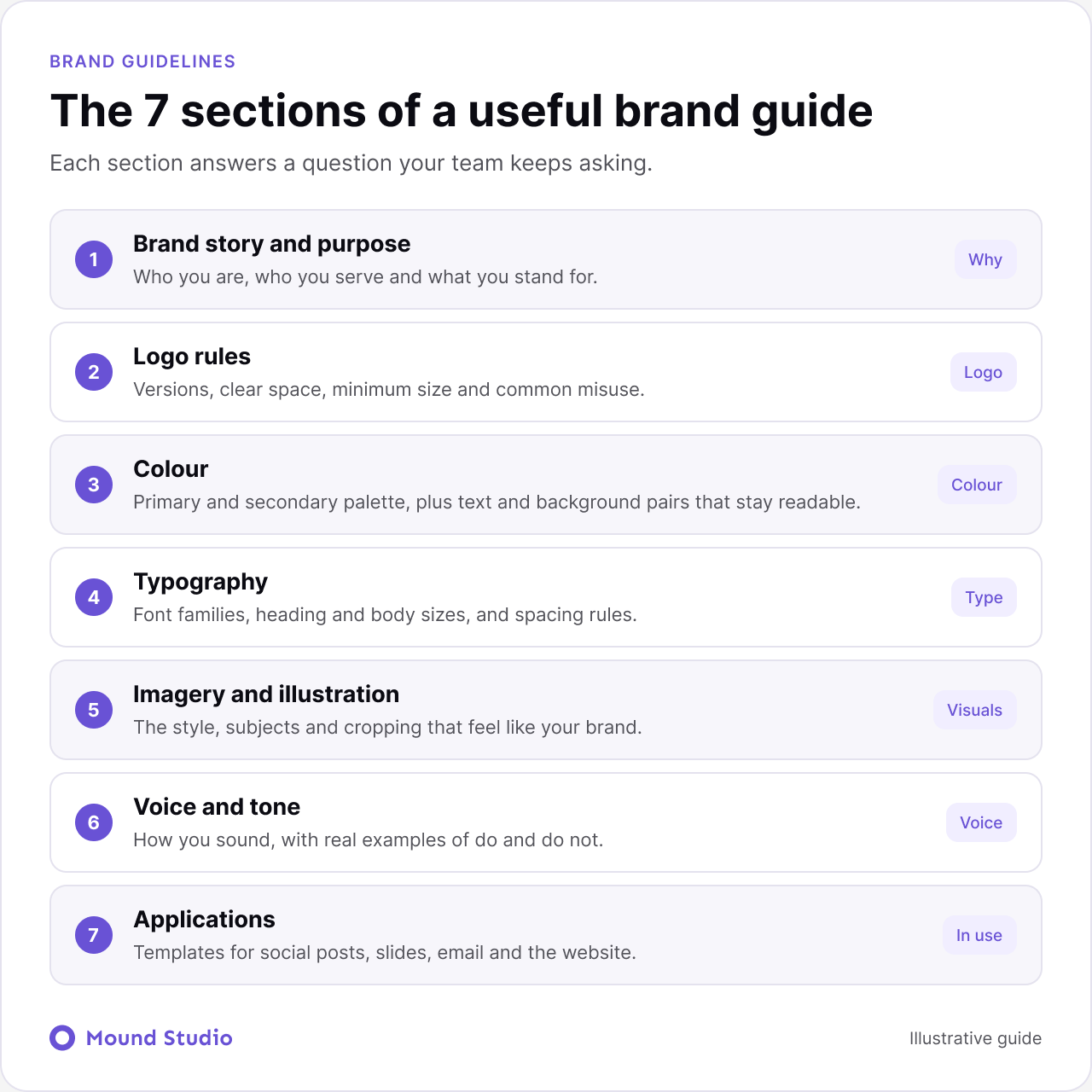
Start with why the brand exists, who it serves and what it stands for. Keep it to a page. This section gives context to every rule that follows, and it helps people decide in cases the rules do not cover.
Show every version of the logo, such as the full logo, the compact mark and the one-colour version. Explain clear space, the smallest size it can be used at, and where each version belongs. Then show what not to do: stretching, recolouring, adding effects, placing it on a busy photo. A page of visual examples of misuse is the most useful page in this section.
List the primary and secondary colours with their names and values for each medium you use. Then go one step further than most guides do: show which text and background pairs are readable, so that people do not put light grey text on a white background. If you want help choosing a palette in the first place, read how to choose brand colors.
Name the font families, the fallback fonts and where each is used. Show a simple type scale for headings, body text and captions, with guidance on spacing and line length. Note where the fonts can be downloaded or licensed, because missing fonts are one of the top reasons documents look off-brand.
Describe the style of photos, icons and illustrations, with examples of what fits and what does not. Cover subjects, lighting, cropping, and how people are shown. If you use illustration or icons, include the grid and the stroke rules so new pieces match the old ones.
Describe how the brand sounds using a few clear traits, and back each with a before and after sentence. Explain how the tone shifts between contexts, for example a product error message compared with a launch announcement. Real sentences are far more useful than adjectives.
Show the brand in use: social posts, slides, email, the website, signage or packaging. This is where guidelines stop being theory. Provide templates people can start from, not just pictures of finished work.
Take the logo page of a small company. At the top, one line says what the page covers. Below it, the primary logo sits on a plain background with the clear space marked. Next to it are the compact mark and the one-colour version, each with a short note on where to use it. Underneath, four small examples show common mistakes: stretched, recoloured, placed on a busy photo, and shrunk too far. At the bottom, one button downloads the files.
That is the whole page. It answers the questions people ask most, it takes a minute to read, and nobody has to email the designer for a file. Aim for the same pattern on every page of the guide: a short rule, a picture, a wrong example, and a link to the assets.
Not every brand needs a long document. Match the size of the guide to the size of the team using it.
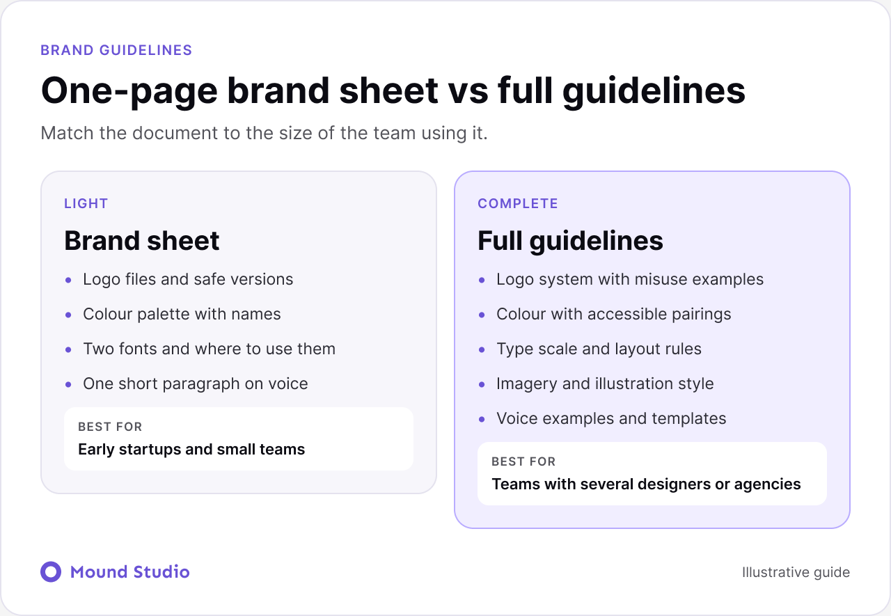
If you are unsure, start with a short sheet and grow it. A guide that is used every week beats a beautiful one that nobody opens. As the brand grows, the sheet can expand section by section.
If time is limited, document in order of impact and effort. Rules that prevent the most visible mistakes come first.
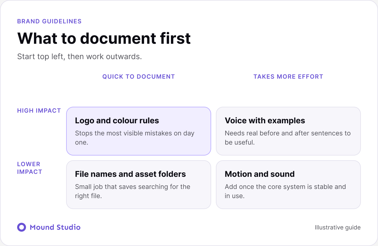
The answers decide the length, the format, and which sections come first. A short conversation with the people who use the brand every day is worth more than a long workshop about brand values.
Put them where people already work. A web page is easier to update and search than a PDF, and it can link straight to downloadable files. A PDF is still useful for sharing with agencies or printers who need a fixed copy. Whichever you choose, keep one official version, put a date and version on it, and retire older copies so nobody uses the wrong one.
| Format | Strengths | Limits |
|---|---|---|
| Easy to share and print, looks the same everywhere | Goes out of date and is hard to search | |
| Web page | Always current, searchable, links to files | Needs someone to maintain it |
| Design file library | Designers use real components and styles | Not friendly for non-designers |
| Slide deck | Quick to write and edit | Layouts drift, files multiply |
Many teams use two: a web page for daily use and a PDF for partners. Just make sure they are generated from the same source.
Brand guidelines describe how the brand looks and sounds. A design system turns those rules into reusable components for a product or website, such as buttons, forms, and layout patterns. The two should agree. If the guide says the primary colour is one blue and the product uses another, people will trust neither. Our post on what a design system is explains how the two fit together, and it is worth reading before you decide how detailed the digital section of your guide should be.
When designers hand work to developers, the brand rules become tokens and styles. A clear guide makes that step easier, and our Figma developer handoff checklist shows what to prepare.
Accessibility belongs in the guide from the start, not as a later fix. For colour, list which text and background pairs are safe to use and which are not. For type, set minimum sizes for body text and captions. For imagery, explain how to write useful alt text. A short accessibility note in each section costs little, and it prevents the most common problems from spreading through every new piece of work. Our website accessibility checklist is a helpful reference when you write this part.
Documenting the ideal, not the real brand. A guide that describes a look nobody uses is ignored. Start from what the brand does today, fix conflicts, and then write the rules.
Writing for designers only. Many people who use the guide are not designers. A salesperson building a slide or a partner writing a post needs plain steps and templates, not design theory.
Leaving out the reasons. A rule with a reason is easier to follow and easier to apply in new situations. "Keep clear space around the logo so it stays legible on busy pages" works better than "Keep clear space".
| Section | Include | Done when |
|---|---|---|
| Story | Purpose, audience, values | Fits on one page |
| Logo | Versions, clear space, minimum size, misuse | Downloadable files are linked |
| Colour | Palette, names, readable pairs | Values exist for screen and print |
| Typography | Fonts, scale, spacing | Font source is listed |
| Imagery | Style, subjects, cropping | Good and bad examples shown |
| Voice | Traits, do and do not | Real sentences included |
| Applications | Templates for main channels | Templates open and work |
Guidelines are easiest to write at the end of a brand project, when the decisions are fresh. If you are changing a brand that already exists, read our guide to how to rebrand your business first, because the guide should describe the new brand, not a mix of old and new. For a new brand, the guide usually follows the core identity work described in brand identity elements.
A guide fails slowly, when nobody has time to update it. A few habits keep it alive. Name one owner and one backup. Keep a short change log at the top with dates. Ask people to send questions to one channel and turn repeated questions into new sections. Review the guide on a fixed schedule, and always after a visible change such as a new logo version, product or channel. When you retire an old asset, remove it from every shared folder, not just the guide.
It also helps to build small checks into daily work. Ask the person approving a design to open the guide, not their memory. Add a link to the guide in the template files that people already use. When an agency joins a project, send the guide on day one and ask them to confirm they have read the parts that matter for their job. These steps take minutes and save a lot of correction later.
Good brand guidelines are short enough to use and specific enough to settle arguments. Start with logo, colour, type and voice, show real examples, publish in one place and give the guide an owner. If you want help building a brand system your team will follow, talk to us about your brand.
Brand guidelines are a document that explains how a brand looks and sounds, and how to use its assets correctly. They cover the logo, colour, typography, imagery, voice and templates, so anyone creating something for the brand can do it consistently.
As long as your team needs and no longer. A small business can work well with a short sheet. A company with many designers and agencies needs a fuller guide. Length matters less than whether people can find an answer in under a minute.
The brand identity is the set of assets: logo, colours, fonts and more. The guidelines explain how to use them. One is the toolbox and the other is the manual.
One named person or a small group, often in marketing or design. Ownership matters because someone has to approve updates, answer questions and keep the files current.
Review them on a set schedule, and whenever the brand changes in a visible way, such as a new product line, a new logo version or a new channel.